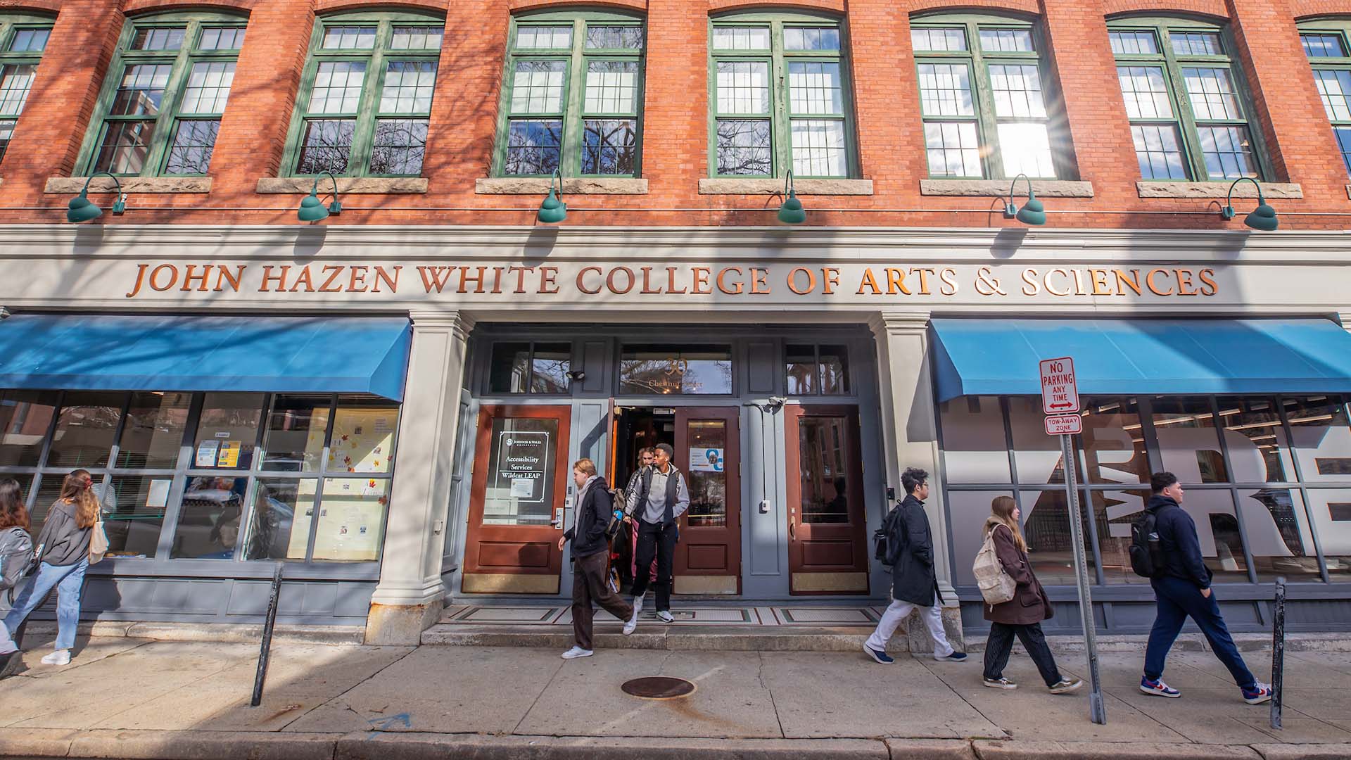
Arts & Sciences
Arts & Sciences
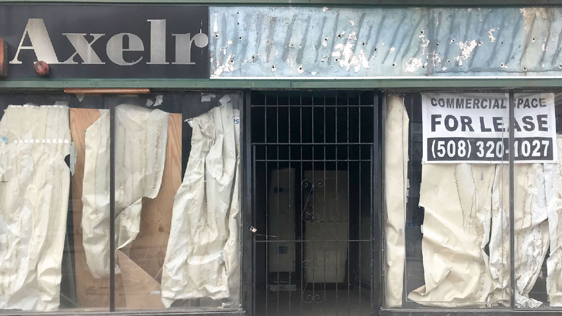
Window Graphics Breathe New Life to Axelrod Music Building
12/20/2019 | Mention Axelrod Music to music lovers in the state and their eyes quickly fill up with nostalgia of a time long gone. Graphic design students at JWU stepped into that world earlier this year, when they began to design environmental graphics for the window panels of the vacant store front.
During a two-part competition/class project that spanned many months, students submitted proposals to design a series of window graphics that would include both musical themes and Providence or Rhode Island landmark themes. Their goal: livening up the building’s crumbling façade, which is located right in JWU’s backyard on Weybosset Street in Providence.
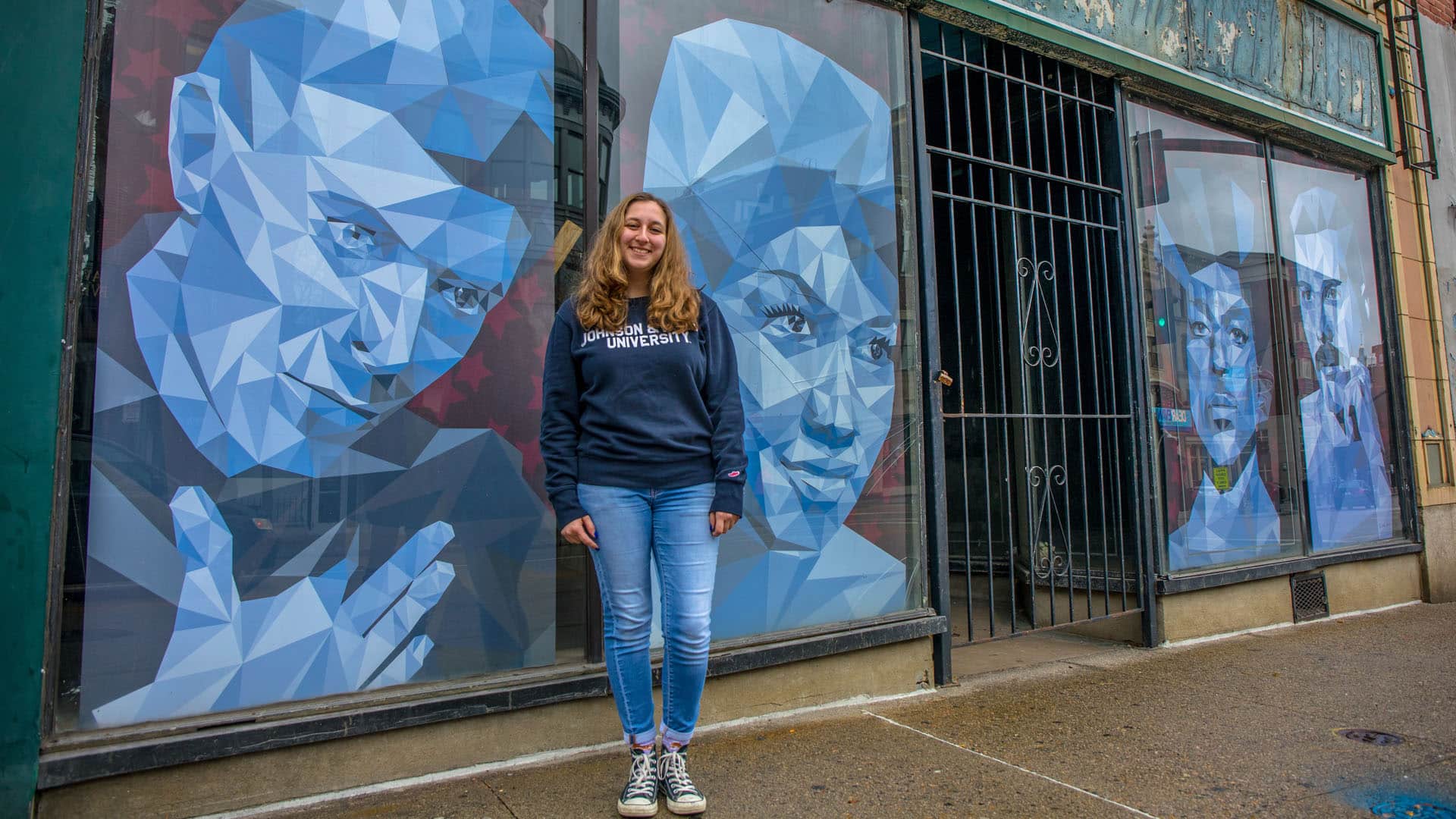
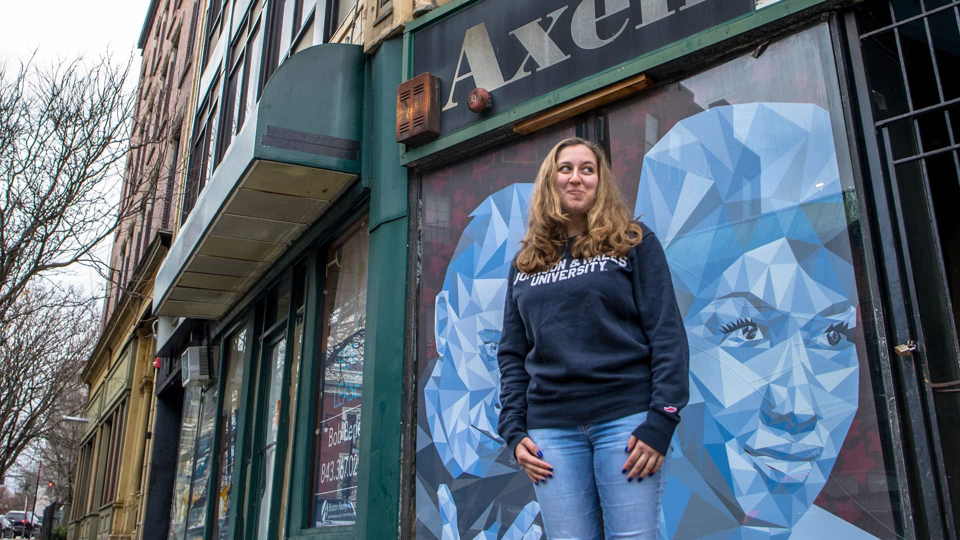
First Design: Kristina Faiola
Kristina Faiola ’22 was among the first students to get involved in the contest, when she started talking to Assistant Professor Tim Cox about a Freddie Mercury drawing she was working on and how she might be able to use it for her designs.
“I was really excited about it, because I was actually working on the drawing and it was music related,” says Faiola. “I thought I could incorporate that into my design, so I showed it to Professor Cox and he said I should go for it.”
With that as her inspiration, Faiola, who has an art background, set on creating digital portraits of legendary musicians that would be recognizable to anyone passing by the windows. She settled on David Bowie, Aretha Franklin, Prince and Freddie Mercury.
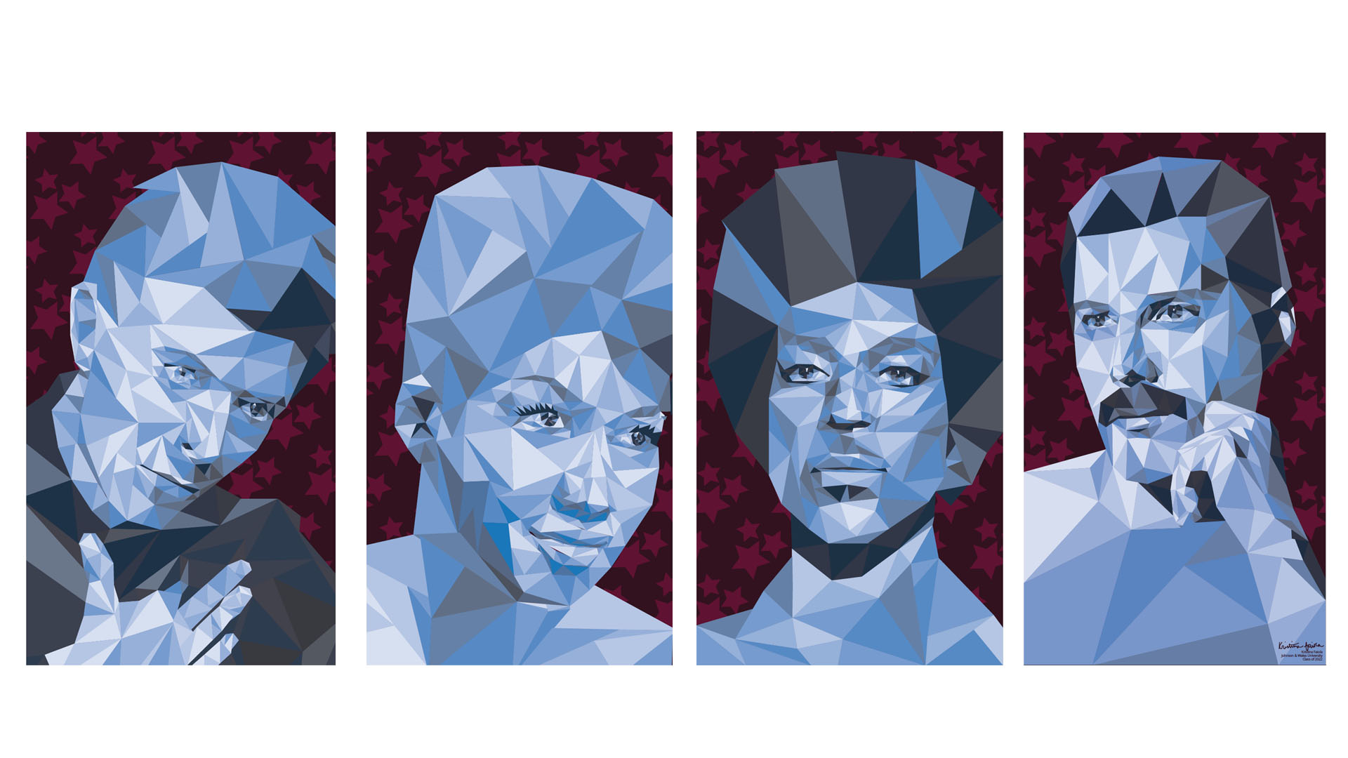
“I could have chosen anything, but I figured it would work better if I related it [the design] to older music since it's an older music store. I just felt like it went better than something more current,” Fiola adds.
“I worked really hard and did so much research, then came up with the four panels. Originally, I had John Lennon instead of Aretha Franklin in it, but I decided to add a female,” she says.
Faiola also worked hard on finessing the monochromatic technique she used on the portraits. “I had never worked with that style before this project,” she says. “I had to make changes and adapt my design to figure out where certain shades should go all while looking at the picture. It took me a while, but once I got that down pat, it pretty much just flowed — it was pretty easy.”
Assistant Professor Jeff Drury worked with Faiola during the revisions phase of her graphic design work. “Kristina’s concept was the most ‘musical’ and it was also very expressive,” says Drury. “It just had a lot of the right components to it, she was very good at sticking with us [through revisions], which was awesome.”
That is her super power.
For Drury, this project offered students a fantastic opportunity to work on a big scale. “When I heard about this project, I was very excited because I grew up going to Axelrod’s. I went there every day after high school so I knew it very well. I thought every student in the world would want to do this project, especially because they would get these huge windows to design for.”
He describes the revision process as very slow and thoughtful. And compliments Faiola’s sketching skills and her ability to transfer them into a digital format almost seamlessly. “What you see up there, it’s literally what she had on paper — that is her super power.”
Second Design: Darren Pollock
Drury has similar praise for Darren Pollock ’20, whose graphics were selected to go up on the Axelrod windows next to Faiola’s designs.
“Darren is super humble, and incredibly talented. He just works harder than nearly anyone I’ve ever seen,” says Drury.
Associate Professor Karyn Jimenez agrees about the quality of the students’ designs. “I’m honestly continually impressed,” she says. “This is my 13th year at JWU, and each year students get stronger and their skill sets and ability to craft these concepts are just really cool.”
I’m honestly continually impressed.
Jimenez adds that for the second part of the project, all 18 students from her Digital Studio II class submitted ideas as part of the class. This time around, she says, the design parameters were different. “I told the students [the designs] didn’t have to be music based, that instead they could focus more on something Providence or Rhode Island based.”
“The concepts were all very different, and to narrow it down, at the end of the student critique, I had the students all give me their top three choices which pretty much aligned with the top two students I had in mind. Then I tallied those, and passed them along to [others in the department] for a second opinion. That’s how we selected the winners,” Jimenez says.
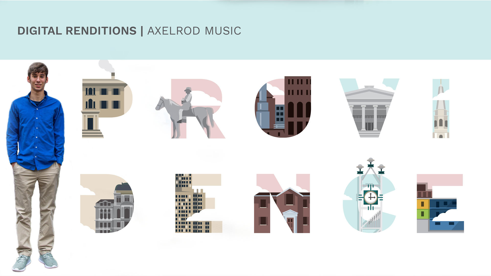
Pollock’s designs were among the top two selected. He chose to incorporate historical buildings important to Providence. “Providence definitely has a large historical aspect to it, I’d say more so than some other cities,” says Pollock.
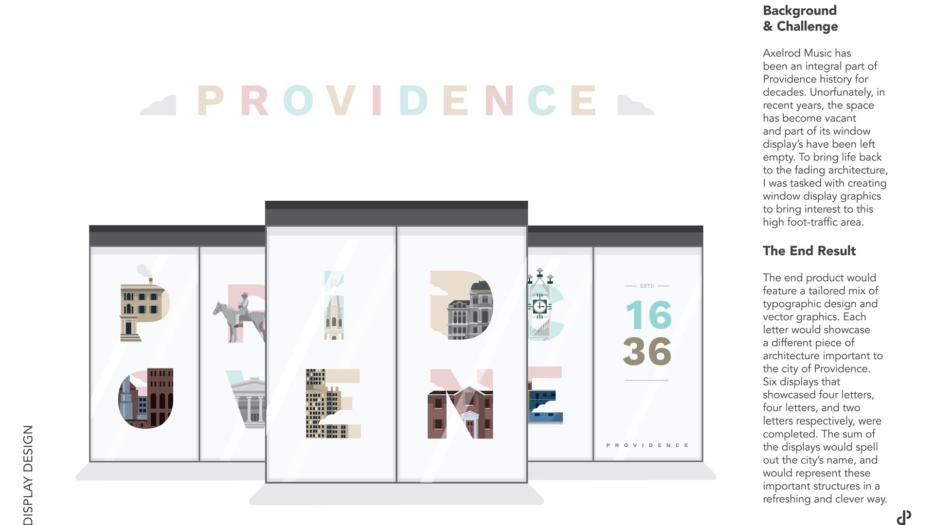
For his design, Pollock chose to use images to spell out the word Providence. He created more than 20 illustrations focusing on iconic city buildings, then he narrowed that down based on what worked better aesthetically with his idea. “The concept I chose wasn't the easiest because there's multiple phases when you're working with the letters, but you're also making the illustrations, and then figuring out how does each one fit into each letter,” he says. “Working through that was a little bit difficult but also, I guess, in the end it paid off.”
Third Design: Alex Graham
Although there was only room for one more installation at the Axelrod Music building, Jimenez says the department ended up choosing Alex Graham’s window designs as a runner-up in the competition because of the exceptional quality of his work. In the future, she adds, his work could be installed somewhere else at JWU.
“His design ended up incorporating more statewide elements,” she says of Graham’s work. “It’s different from what Kristina and Darren did, and kind of cool because [through it] you get an overview of all of Rhode Island.”
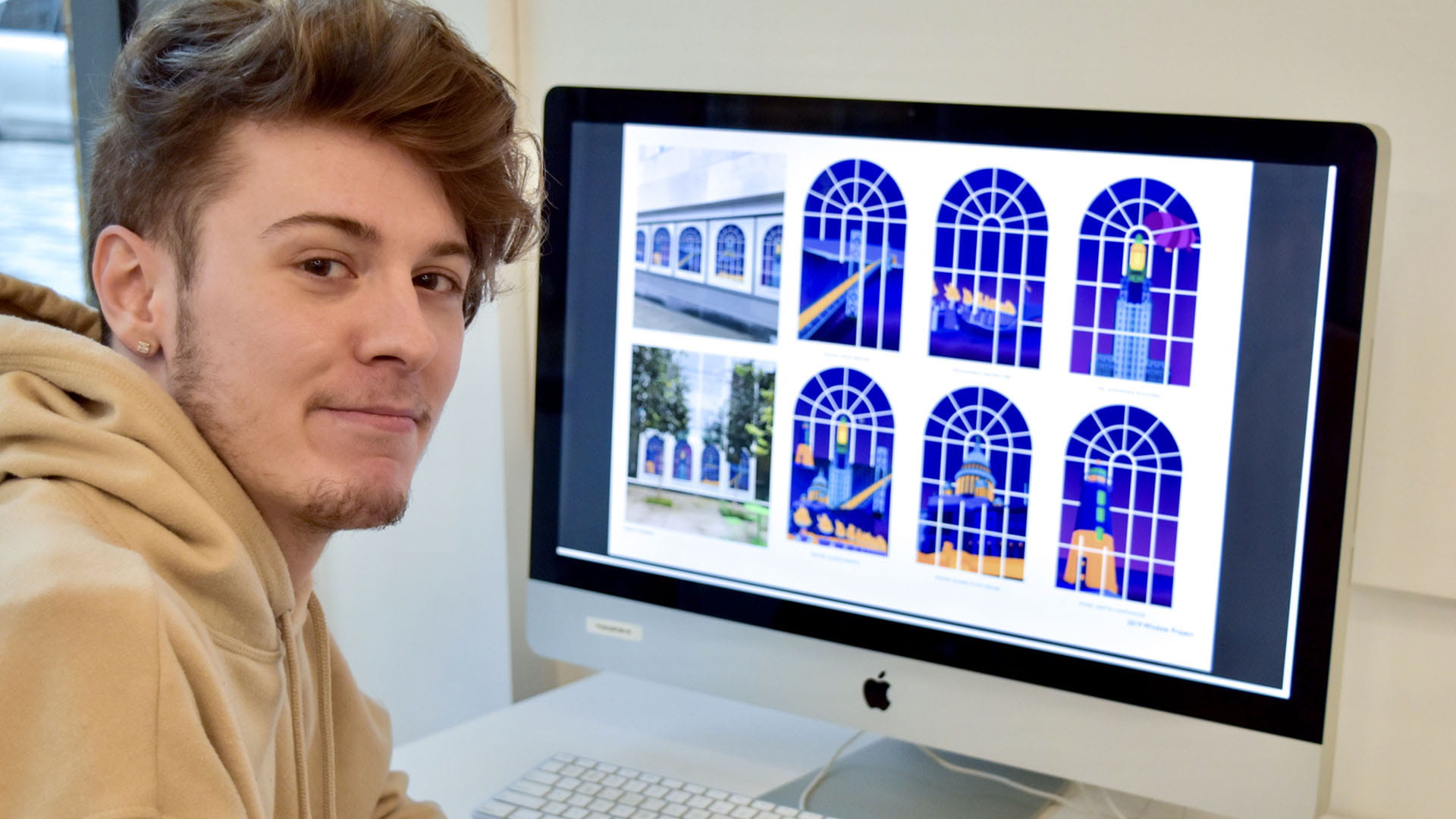
Graham ’20, is happy his work made it this far in the competition. “I was extremely hopeful going into this [competition,]” he says. “I’m extremely grateful that they’re even considering it and I’m grateful to my professors for appreciating the effort that went into my work.”>
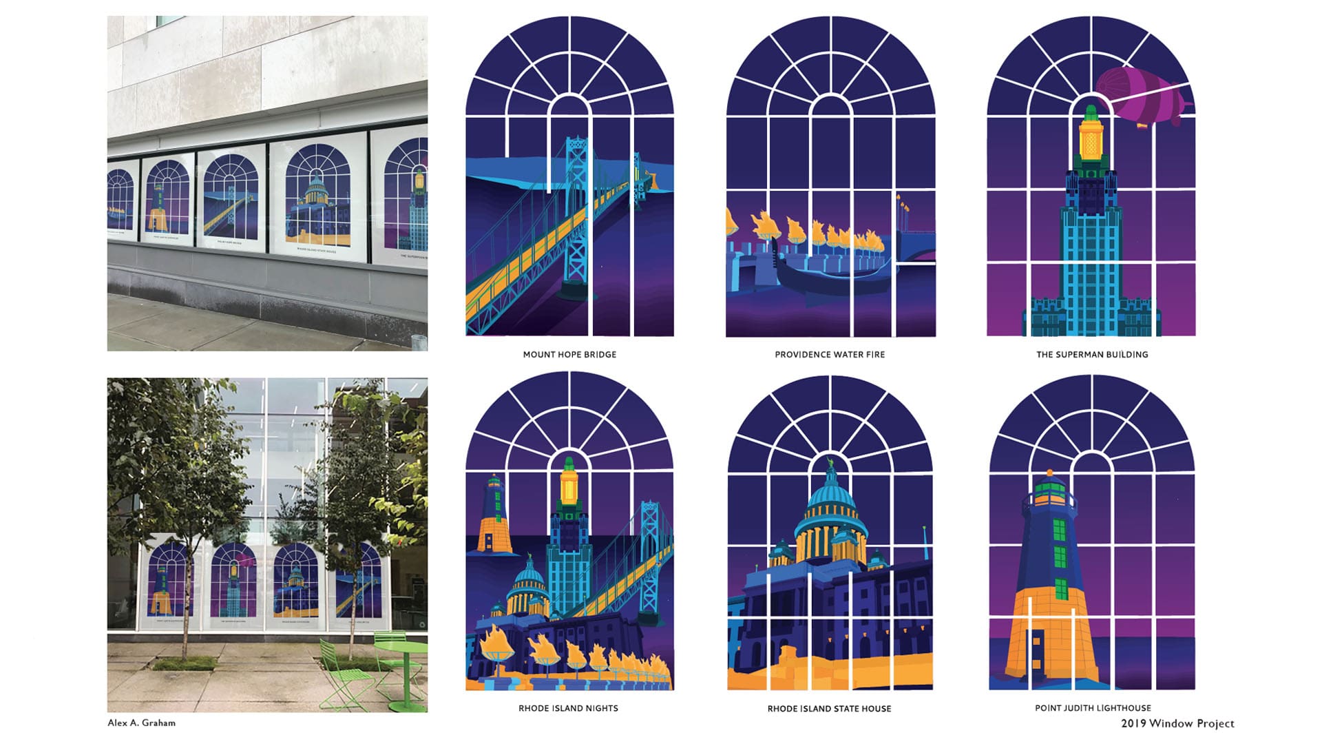
He adds that for his design he wanted to focus on iconic RI architecture, without using images of anchors or of Newport. For inspiration, he focused on the window frame located at 50 Kennedy Plaza and used it as a grid to layout his designs. “Once I got my grid, I could measure out what I wanted to break out of the window frame, where I wanted things to go, and how to stylistically make things interesting,” Graham says. “I wanted to really make this original, so stylizing the illustrations and adding a lot of details took a long time. But I felt that once I got one design [the Point Judith Lighthouse] down, then I could start to refine things and really start to pay more attention to things like the color palette and how to stylistically show off the architecture.”
Setting the Pace One Design at a Time
Drury and Jimenez both feel that that when students work on this kind of project, they get real-life benefits beyond what they can get in the classroom.
“These [type of] projects have such potential on so many levels,” says Drury. “For one, they’re working for something outside the classroom. They’re also getting feedback that’s going to help them go out into the bigger world. And they’re getting the recognition of having their work actually installed on a level that they wouldn't have had options to do before.”
Jimenez adds that when student work is recognized, JWU is recognized. “To me, and I know to the rest of our faculty, it's so important that people [outside JWU] know what we're doing here and they realizing like the quality of what's coming out of here. So, any time we can have something out there for the public to see, that's huge for us.”
Our students have done an exceptional job!
Providence Campus President Marie Bernardo-Sousa LPD ’92 agrees. “The spine of our Downcity Campus is on Weybosset Street, an area of the city in which we take great pride. When buildings are in the process of being renovated and updated, we often work with our neighbors to present a dynamic cityscape and showcase our students’ talents. When we discussed the possibilities with our neighbors for this project, they enthusiastically supported the concept. Our students have done an exceptional job!”
Related Posts
Students
Arts & Sciences
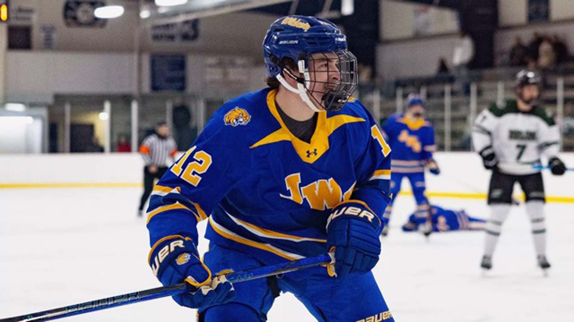
On and Off the Ice with Hockey Captain Davis Bone
Arts & Sciences
Shaping Tomorrow’s Classrooms: JWU’s School of Education
Arts & Sciences
Alumni
News